August 2001Study Tip:
Stochastic Fundamental
Behavior
by Howard Arrington
To understand a study more thoroughly, it needs to be observed on
a theoretical Elliott wave formation. Too often a study is
slapped on a chart, adjustable parameters are tweaked, and with the
benefit of hindsight some trade signals are derived. The
advanced student might go the extra mile and delve into the
mathematics of the study's formula. But the fundamental
behavior of the study is not understood well. This article
will help you understand Stochastic better through an original
approach.
The basic concepts of the Elliott Wave Theory are that action is
followed by reaction, and there are 5 waves in the main trend,
followed by 3 waves in the correction. Since this
pattern is seen over and over in the markets, a theoretical
chart based on these principles will be used so Stochastic can be
analyzed without market 'noise' obscuring its fundamental behavior.
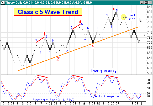
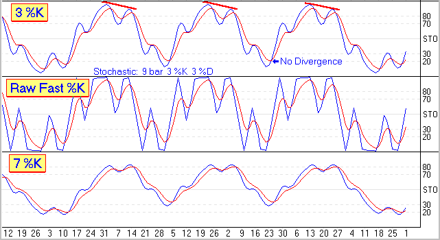
Various characteristics can be found in the 9 bar slow Stochastic
study applied to this theoretical chart.
5 Wave Minor Trend Analysis: (blue 1-2-3-4-5 small
numbers)
1) The most rapid rise in Stochastic %K (blue line) occurs
in minor wave 1. %K rose from below 20 to 70.
2) Minor wave 2 caused %K to retrace to %D (red
line), but both are still above 50.
3) Minor wave 3 takes Stochastic higher, with %K
reaching a lofty high. In the real world %K will often reach
80 but rarely 90. Study tip: It is important to
realize that it is minor wave 3 that takes %K to its highest
high!
4) Minor wave 4 causes %K to cross below %D from its
lofty high. This crossing is the FALSE signal that traders
fall for all too often. Going short because of a turn at
3 is premature, and your stop just above the top at 3
is taken out by the final thrust to the top at minor wave
5. The psychological tendency is to ignore the signal
at 5 because of the loosing short attempted at wave 3.
5) Minor wave 5 causes %K to rise again, often
crossing back above %D, but the market lacks the duration in trend
to elevate %K to a higher high. When %K turns down and crosses
%D the second time, this is the signal. Study tip:
Look for divergence, where the price action put in new highs, but
the study does not. Divergence is marked on the
theoretical chart with short red lines.
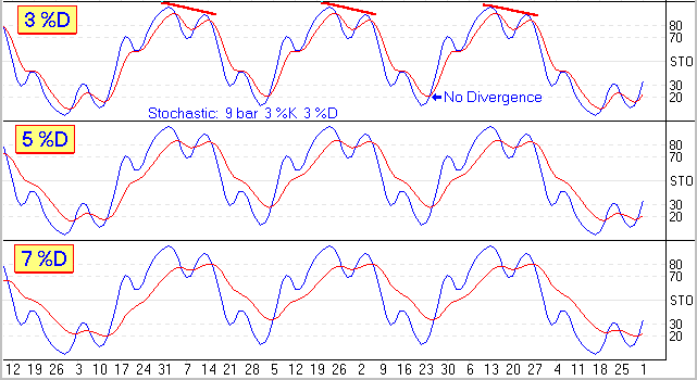
3 Wave Minor Correction Analysis: (blue a-b-c
letters)
a) Minor wave a returns to the previous
support level of minor wave 4. But the drop of %K is
huge, falling from a lofty high to 30. This rapid fall is
similar to the rapid rise that occurred in minor wave 1.
b) Minor wave b is a Fibonacci
retracement from a back towards 5.
The example has its price stopping at the top of wave
3. The effect on %K is to rally back to the %D line,
but both remain under 50.
c) Minor wave c takes %K to new lows
below 30. The example shows a drop below 20, which would be
unusual in the real world for a wave c
correction. Study tip: Divergence will not occur
this time. Therefore, the signal to go long is the first
time %K crosses above %D. This is shown in the example at
major waves 2 and 4 (large red numbers) where the
market meets the long term support trend line shown in orange.
Signal Summary:
The process starts over again as Stochastic behaves in a similar
fashion for major waves 3 and 5 as it did for major wave
1. The a-b-c correction of major wave 4 will be similar
to major wave 2. The ideal place to short is after major wave
5 is in place, at what will be minor wave 2 of the first trend leg
of the new major correction. This point is highlighted with a
yellow circle.
Study tip: Stochastic had three turns with divergence at
the end of major waves 1, 3 and 5 marked in red.
Stochastic turns at the end of the two reaction waves 2 and 4 did
not have divergence. Look for this pattern to help you
identify the 5th major Elliott wave. The divergence signal at
the end of wave 5 is the ideal place to go short after a major
up-trend, or long after a major down-trend.
Averaging Method:
Now that the fundamental behavior of Stochastic is understood as
the Elliott waves develop in a market, the theoretical chart will be
used to observe the effect of different parameters on the Stochastic
formula. The first decision is whether to use
Exponential or Simple moving averages in the Stochastic
calculations. Both examples shown in the next graph use
the same Bar, %K and %D parameters of 9, 3, 3.
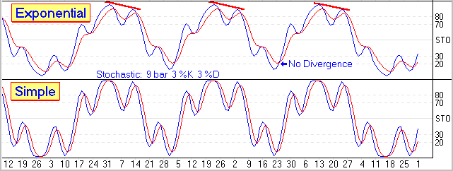
Study the patterns in both graphs. The same fundamental
behavior is there, but easier to see with Exponential
averaging. My personal preference is to use Exponential
averages in Stochastic.
Bar Parameter:
Now the Bar parameter will be analyzed. This parameter
controls the number of bars in a group that are examined to
determine the highest high and lowest low, or range for the
group. A raw Stochastic is calculated by measuring where
the last price is in the group's range. Raw Stochastic = 100 *
( Last - GroupLow ) / GroupRange. In these examples, the %K
and %D parameters will be 3 and 3, using Exponential averages.
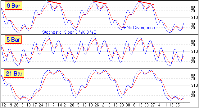
Smaller Bar parameters increase the oscillation of the
Stochastic. Larger Bar parameters dampen the oscillation
and make it harder to see Divergence. Study tip:
Select a Bar parameter that is half the average length of the major
waves. The theoretical chart has 24 bars in a major trend
wave, and 13 bars in a major correction wave. The average of
these two waves is 18 bars. So, the 9 Bar parameter gives the
best Stochastic pattern.
%K Parameter:
The %K line is an average of the raw Stochastic. If the raw
Stochastic is not smoothed by averaging, then this is called a Fast
%K. The raw Stochastic that is smoothed by averaging is
called a Slow %K. These examples show the effect of the
%K parameter on a 9 Bar Stochastic with 3 for the %D parameter using
Exponential averages.
The raw Stochastic or Fast %K is very choppy, and for that reason
is rarely used. Having a large %K parameter dampens the
Stochastic oscillation. Study tip: Use
either 3 or 5 as the %K parameter.
%D Parameter:
The %D line is an average the %K line. The Slow %K
line is an average of the raw Stochastic, which makes the Slow %D
line an average of the average. These examples use a 9 Bar
Stochastic with 3 for the %K parameter using Exponential averages.
The larger the %D parameter, the more dampened the oscillation of
the %D line. The effect will be to get the signal from
%K crossing %D one or two bars later in the turn. Study
tip: Use 3 as the %D parameter.
Well, that wraps up the analysis for Stochastic. The
theoretical chart has been a tremendous aid in understanding the
fundamentals of Stochastic behavior. Let the author know if
you enjoyed this article. If so, the theoretical chart will be
used in future articles to analyze the fundamental behavior of other
studies and tools.
ESPL Script:
Theoretical Wave
Builder
The Ensign Software Programming Language (ESPL) was used to
create the theoretical chart used in the first article. The
complete ESPL script is listed here.
// Author: Howard Arrington
//
Date: 08-17-2001
// Purpose: Create a
theoretical chart file
//
procedure
Theory;
var
sPattern, s24Up, s13Up, s24Dn, s13Dn:
string;
s5WaveUp, s3WaveUp, s5WaveDn, s3WaveDn:
string;
t: TDateTime;
c,i,j,k,n,d,count:
integer;
price: real;
begin
s13Up:='5U3D5U'; {5 up bars, 3 down, 5
up}
s24Up:='5U3D8U3D5U';
s13Dn:='5D3U5D';
s24Dn:='5D3U8D3U5D';
s3WaveUp:=s24Up+s13Dn+s24Up;
s5WaveUp:=s24Up+s13Dn+s24Up+s13Dn+s24Up;
s3WaveDn:=s24Dn+s13Up+s24Dn;
s5WaveDn:=s24Dn+s13Up+s24Dn+s13Up+s24Dn;
sPattern:=s5WaveUp+s3WaveDn+s5WaveUp+s3WaveDn+s5WaveUp;
{Major Up}
sPattern:=sPattern+s5WaveDn+s3WaveUp+s5WaveDn;
{Minor Down}
sPattern:=sPattern+s5WaveUp+s3WaveDn+s5WaveUp+s3WaveDn+s5WaveUp;
{Major Up}
sPattern:=sPattern+s5WaveDn+s3WaveUp+s5WaveDn+s3WaveUp+s5WaveDn;
{Major Down}
sPattern:=sPattern+s5WaveUp+s3WaveDn+s5WaveUp;
{Minor Up}
sPattern:=sPattern+s5WaveDn+s3WaveUp+s5WaveDn+s3WaveUp+s5WaveDn;
{Major Down}
t:=EncodeDate(1990,1,1); {January
1, 1990}
i:=1; k:=length(sPattern); n:=0; price:=500;
count:=0;
Chart(sPath+'\Hist\Theory.D');
Finished(15);
while i<k do
begin
if IsNumeric(Copy(sPattern,i,1),c) then
n:=n*10+c
else
begin
if Copy(sPattern,i,1)='U'
then d:=10 else d:=-10;
for j:=1
to n do begin
inc(count); {count
bars}
t:=t+1; if
DayOfWeek(t)=7 then t:=t+2; {skip
weekends}
SetVariable(eBarCount,count);
SetBar(eDate,count,DateToLong(t));
SetBar(eVolume,count,count);
SetBar(eInterest,count,count);
if d>0 then
begin
{build Up
bar}
SetBar(eOpen,count,price+1);
SetBar(eHigh,count,price+d);
SetBar(eLow,
count,price);
SetBar(eLast,count,price+d-1);
end
else
begin
{build Down
bar}
SetBar(eOpen,count,price-1);
SetBar(eHigh,count,price);
SetBar(eLow,
count,price+d);
SetBar(eLast,count,price+d+1);
end;
price:=price+d;
end;
n:=0; {start new quantity}
end;
inc(i); {next character in pattern}
end;
writeln('Done...');
btnReset.click;
end;
begin
if who=1 then
Theory;
end;
Trading Tip:
Automated 1x1 Gann Angle
by Howard Arrington
Every so often some trader engages in a discussion with me
regarding the virtues of plotting 45 degree angles on their
chart. Invariably their infatuation with this idea is based on
a shallow understanding of what a 45 degree line really means, or is
supposed to indicate. Their introduction to 45 degree lines is
usually from reading something about the works of W. D. Gann and how
he plotted 45 degree angles on his charts.
Plotting a line on a computer generated chart physically at a 45
degree angle is worthless. The truth of this statement
can be illustrated by comparing these two charts.
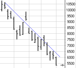 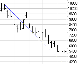
The line is plotted at a downward 45 degree angle in both charts,
but as can be seen, the line passes through the chart bars in
different places. The line which looks very useful as an
indicator of a trend in the left-hand chart suddenly looks useless
in the right-hand chart. So what happened? The
vertical spacing of the chart scale changed!
Computer generated charts typically use a scale range that covers
the highest high and the lowest low of the data set that is being
plotted. This scale is mapped to the physical size of the
chart window, which might be a couple inches like the examples, or
it might be the full size of your monitor display. Not
only can the scale range be dynamic, but the bar spacing is also
dynamic. The following example uses the same range as the 1st
chart, but with a narrower spacing between the bars. The
position of the 45 degree line appears quite different now.
Since 45 degree lines are so arbitrary in their relationship to
the bars, what then was W. D. Gann doing in plotting 45 degree
angles on his charts? Gann referred to the 45 degree angles as
1x1 lines (one by one lines). The line was being plotted on
his charts with a mathematical slope of one unit of price per one
unit of time. Gann would manually construct his charts using
graph paper with a square grid. The vertical price grid would
be labeled with a price interval such as 2 cents. Thus,
the price unit is the grid interval of 2 cents. The bars
would be plotted on the horizontal grid, such as a daily bar on
every grid interval. Thus, the time unit would be one
day.
A graph constructed in this manner would give Gann's 1x1 line the
following slope definition: 2 cents per day.
A line with this slope could be easily drawn using a 45 degree
triangle because of the way the graph paper was laid out. So,
a 45 degree line and a 1x1 line with a slope of 2 cents per day
would be one and the same thing only when a specific graph
paper grid was used.
Computer generated charts with their dynamic scale ranges and
dynamic bar spacing must draw 1x1 lines according to a slope
definition. The plotted 1x1 line may or may not (usually not)
be at a 45 degree angle. When you see a reference to a 45
degree angle, always observe the price grid interval, and the time
interval so you know the 1x1 definition for the slope. The
slope will be one unit of price for one unit of time. Once the
slope is known, the same line can be drawn on a computer generated
chart.
In Ensign Windows, the slope of a trend line is shown as one of
the parameters for the line. If you want a line to be
drawn with a specific slope, you can edit the slope parameter.
The slope of the line in the following chart is -250 points per
bar. The line will plot in the same position through the
bars regardless of changes in the scale range or bar spacing.
As changes are made to the chart grid, the angle the line is plotted
at will change. The line's slope will remain constant and its
relationship to the bars will remain constant.

For years, I thought finding a useful slope for the
1x1 Gann line was what Gann analysts meant by the phrase 'squaring
time and price.' However, my new understanding is that
it is a literal relationship that can be expressed mathematically
as:
Price = Time squared
or P = t ^ 2
For additional information and treatment of this
mathematical relationship, please read my 'Time and Price' article
in the January
2001 issue of the Trading Tips newsletter. This
relationship gives us the needed mathematics for automatically
calculating the slope for the 1x1 Gann angle.
To calculate the slope of the 1x1 line, two prices are
needed, and a time interval. The first price
P1 will be the price on the chart where the 1x1 line
(or Gann Fan) is anchored. Usually this is the top or
bottom price of a significant trend. The time interval is
calculated from P1 by normalizing P1 to fall in the range of 100 to
999. If P1 is below 100, multiply it by 10 as many times as
needed until it is in the range of 100 to 999. If P1 is at or
above 1000, repeatedly divide it by 10 until it is in the range of
100 to 999. Then the time interval t
is found by taking the square root of P1.
Gann's Square of Nine is used to determine the 2nd
price P2. P2 is related to P1 by some
degree of rotation around the Square of Nine. The commonly
used degrees of rotation are 360, 180, 90, and 45 degrees. P2
can be calculated using this formula:
P2 = ( t + degrees of rotation / 180 ) ^
2
Remember, the time interval t was determined
by taking the square root of the normalized price P1.
Example: If the trend top or bottom price is $144.00, then the
time interval is 12 bars. To find the price that is 180
degrees around the Square of Nine, P2 would be ( 12 + 180/180 ) ^ 2,
which equals 13 squared or $169.00.
The slope of the 1x1 line is calculated using this formula:
slope = ( P2 - P1 ) / t
Continuing the example, slope = ($169.00 - $144.00) / 12 bars,
which equals $2.08 per bar. If the 1x1 line determined in
this manner is too steep to be useful on the chart, then it is
appropriate to use a smaller degree of rotation around the Square of
Nine, such as 90, 45, 22.5, or 11.25 degrees, etc. If the 1x1
line is too flat to be useful on the chart, then it is appropriate
to use a higher degree of rotation such as 360 or 720 degrees.
This technology is built into the Gann Fan tool in Ensign
Windows. The Gann Fan is placed on the chart by selecting the
point for the vertex. The 1x1 line can be located manually by
selecting a 2nd point, or let Ensign Windows determine the 1x1 slope
automatically using the mathematics developed in this article.
The following charts show the Gann Fan with the slope of the 1x1
line determined automatically from the P1 anchor price at the fan's
vertex.
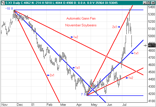
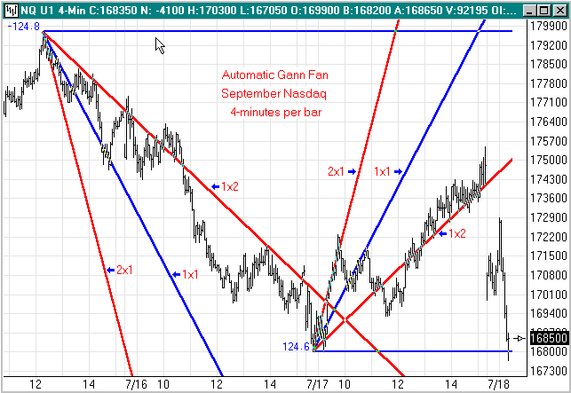
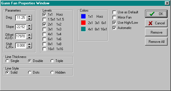
Ensign Windows does an excellent job of selecting
which degree of rotation to use in determining the slope of the 1x1
line, but even this parameter can be manually overridden on the
tool's properties window. For the fans on the NQ U1 chart, the
Gann Fan Properties Window shows that the degree of rotation used
for the slope calculation was 11.25 degrees. Other fan
lines can be shown, but were not included in the illustrations to
keep the charts from being cluttered with too many fan lines.
Everyone is invited to download Ensign Windows and
give the program a thorough evaluation. Ensign Windows can be
downloaded from Ensign Software's web site at file:///C:/EnsignSoftware/index.htm.
|