February 2003Trading Tip:
Price Action - The Footprint of the
Money
Judy MacKeigan - Buffy
"What is Price Action?" is a frequently asked question by
aspiring traders. Traders who ask, feel it is a well kept
secret when all they receive for an answer is: 'Swing highs, swing
lows, test of top/bottom, etc., are all price action.'
The answer still leaves them in the dark. Understanding price action
enables a trader to minimize questionable entries and improve
exits. Price action is the footprint of the money.
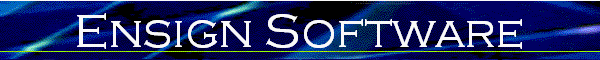
Let's start with the very basics. The bars on the following chart
are labeled as traders commonly referred to them.
Up Bar: is a bar with a higher high and higher low
than the previous bar. The bars marked off are in an up trend.
Notice how the close is higher than the open until what turns out to
be the last bar of the trend where the close is lower than the
open. There were more sellers then buyers on the last
bar.
Down Bar: is a bar with a lower high and lower low
than the previous bar. The bars marked off are in a down
trend. Notice how the close is lower than the open until what
turns out to be the last bar of the trend where the close is higher
than the open. There were more buyers then sellers on the last
bar.
Inside Bar: also called a narrow range bar, is a
bar with the high that is lower than the previous bar and low that
is higher than the previous bar. Some traders do not consider
an inside bar that has either an equal high or an equal low as an
inside bar, others do. Inside bars usually represent market
indecision. As on any bar, the closer the open and close are
to each other shows just how undecided the market is as neither the
buyers or sellers are in control. Buyers are in control on the
inside bar marked on the chart because the close is at the top of
the bar.
Outside Bar: also called a Wide Range or Engulfing
Bar, is a bar with a high that is higher than the previous bar and
with a low that is lower than the previous bar thereby engulfing the
previous bar. Since the open and close are close together on
the marked bar, neither the buyers or the sellers are in control and
the market is undecided which way to go.
When the open is in the bottom quarter/third of the bar and the
close is in the top quarter/third of the bar, it is said to be
bullish engulfing with the buyers in control. When the open is
in the top quarter/third of the bar and the close is in the bottom
quarter/third, it is said to be bearish engulfing with the sellers
in control.
Another definition used for this bar – especially if candlestick
charts are used - is that the open and close have to engulf the
previous bars open and close and not just the high and low of the
bar. With this definition, the wide range bar or engulfing bar does
not need to have a higher high or lower low to qualify. The
first definition most probably came about with bar charts where it
is harder to notice the open and close.
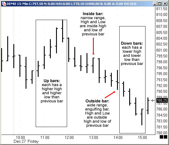
The following chart has the swing highs and lows marked in both
an up trend and a down trend. Price on a given time frame is
in an up trend if it is making a higher highs (HH) and a high lows
(HL) and in a down trend if it is making lower highs (LH) and lower
lows (LL). If price is doing anything else, it is in a
consolidation pattern - range, triangle, pennant, rectangle etc.
The trend is considered in place until price is no longer making
higher highs and higher lows in an up trend or lower highs and lower
lows in a down trend. After a trend is broken, there is
usually a period of consolidation that is easier to see on a lower
time frame. With practice, you will be able to visualize this
going on without looking at the lower time frame.
When price is in a consolidation pattern that is often referred
to as chop, it is usually in a range with no trend pattern to the
swing highs and lows.
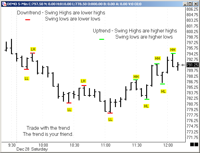
The above chart shows how an exact test of high or low may mean a
change in trend as it failed to make a higher high on test of last
swing high or a lower low on test of last swing low.
- Price was making HHs and HLs until price tested the prior
swing high at A.
- Price made a LL and LH until price tested the prior swing low
at B.
- Price made a LH (The bar that does not touch line at C) until
price tested the prior swing low at C.
- Price was making HHs and HLs until price tested the prior
swing high at D.
It is possible for one time frame to be in one trend and another
time frame to be in a different trend or show consolidation.
This is where the phrase 'trend within a trend' regarding price
action and the different time frames comes from. An example
would be that while price may be rising on a daily chart, the
intra-day chart will show retracements, corrections of various types
and consolidation periods
The true meaning of this and how it can influence your trading,
eludes many. The following exercise is an excellent way to
learn what the phrase 'trend within trend' means visually.
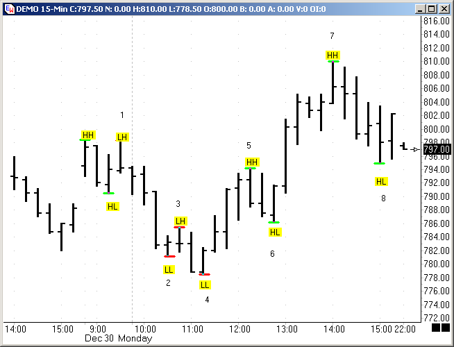
Pull up a 15 minutes chart and mark the highs as higher high (HH)
or lower high (LH) and the lows as lower low (LL) or higher low
(HL). (The note tool was used in Ensign to mark these charts.)
You can also print out the chart and mark it by hand. Use red
lines if price in a down trend and green lines if price in an up
trend. Remember price is in an up trend if it is making HH -
and HL and in a down trend if it is making LH and LL. If price
is doing anything else, it can be a consolidation pattern - range,
triangle, pennant, rectangle etc.
Points labeled 1-4 on the example chart are in a down
trend. Points labeled 5-8 are in an up trend.
Now take the same chart and change the time frame to a 5 minutes
chart, keeping the colored notes and numbers from the 15 minute by
using the padlock with the L to lock lines in Ensign. Mark the
new highs and lows with green numbers for an up trend and red
numbers for a down trend.
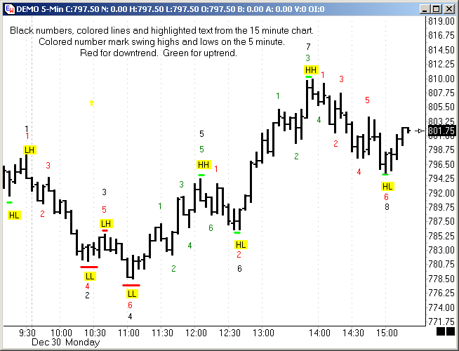
Now we can see by the yellow HH and LL what trend is on the 15
minute at the same time we are able to see the trend on the 5
minute.
Both charts are in a down trend until the 5 minute makes a HH at
the first green #1. The down trend is broken when the LH at
black #3 is exceeded. Price then goes on to make a HL starting
an up trend that continues until price makes a lower high at the red
#1. The 15 minute just made a HH at the black #5 and will not
make a HL until black #6. At this point, we are expecting a HL
on the 15 minute, and are waiting for a long signal on the 5
minute. Some traders would take the entry on the pair of
reversal bars at red #2, others would wait until the last swing high
at red #1 is exceeded.
The time frames are now in agreement (shown by green #1-#4) up to
the black #7 HH. After the HH at #7, the 5 minute goes into a
down trend (shown by red #1-#6) to what is still a HL on the 15
minute at #8. So, while the 15 minute price action shows only
two trends, the 5 minute shows five different trends!
While you may trade the trends on the smaller time frame, waiting
for price action to show it is going to move in the same direction
as the larger time frame is trading with the trend. The trend
is your friend!
The following two setups are from the 2XBline system. The system
is a combination of Buffy's BLine and Jimmer's 2X. (See http://www.dacharts.com/ for
more information.) 2XBline concentrates on the higher
percentage with the trend trades by taking the middle out of the
trend. It is fun to trade the middle of a trend.
It is work to try to catch the tops and bottoms.
There are two templates available to download through Ensign's
Internet Services - 2XBline-35 and 2XBLCircles.
The settings for the indicators in the study windows are
the same on both templates.
Trading Tip:
Money on Floor
by Judy
MacKeigan
MOF stands for Money on Floor. It is just a fancy name for
a pure price action trade. The MOF takes a high percentage
trend trade.
The purpose of a MOF is to:
Catch the
first lower high in an up trend.
Catch
the first higher low in a down trend.
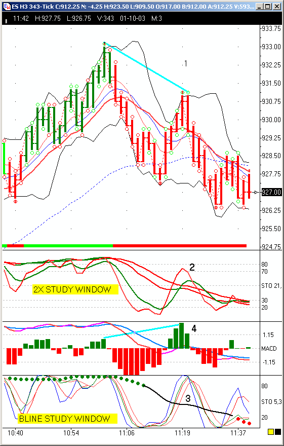
1. Note price is making a lower high at point 1
after making a lower low - trend has changed from up to
down.
Bar high has tagged the upper
Bollinger Band.
Bar colors are red
showing the long term Stochastic in the 2X Study Window has the %K
lower than the %D.
2. In the 2X Study Window note the following at point
2:
The long term stochastic
- two red lines - have rolled over to the
downside.
There is still a
spread between %K and %D.
The
short term Stochastic - the red/yellow and green lines - have pulled
back along with price.
We are
looking for a short trade which is in the direction of the long term
Stochastic.
It is not necessary for the
short term Stochastic to pull back into the sell zone or even cross
the longer term Stochastic.
3. In the Bline Study Window note the following at point
3:
The Bline is the black
line with the green and red colored
dots.
The other 4 lines are
referred to as ribbons.
Their
relationship to the Bline and their direction is what sets up
trades.
The Bline is
falling.
The Ribbons have pulled
back up to the sell zone - this is only necessary for the 5/3/3
(Cyan and Red lines) as you can have ribbon divergence which is
where the 5/3/3 and 9/3/3 do not stay
together.
This setup is called the
first sell signal with a falling
Bline.
We are looking for a short
which is in the direction of the Bline.
4: This is the 3rd signal - Hidden Divergence-HD at point
4. (May also be called Reverse or Continuation
Divergence)
Price has made a lower high
while the MACD histogram has made a higher
high.
Note the HD gave you plenty of
warning this might be a 3 signal trade as the divergence was present
on the completion of the second up bar.
Now it is just a matter of patience until the ribbons get to the
sell zone. When these three signals are present, it is a very
high percentage winning trade.
When 2X and Bline signals are there, while it is still a high
percentage trade, you need to be more aware of what is going on in
the higher and lower time frames. One way to trade this would
be to enter a sell stop just below the last completed bar.
Generally this is called "Stalking the Retracement".
A simple way of describing this setup would be - The first touch
of the opposite Bollinger Band after the long term Stochastic
has turned:
Long term Stochastic down
then touch of the upper Bollinger Band.
Long term Stochastic up then touch of the lower Bollinger Band.
On this chart example, the long term Stochastic is down (bars
red) and price tags the upper Bollinger Band. While this setup
is shown on a 343 constant tick chart, the setup is the same on any
time frame. As with all indicators, the larger moves are on
the higher time frames.
The analysis for the MOF is the evolution of a couple of
ideas. First there was Buffy's Bline. Then there was
Jimmer's 2X. Combined they are called the 2xBline. More
information on the 2X Study Window from Jimmer's 2X system can be
found at http://www.dacharts.com/2x.php
More information on Buffy's Bline can be found at http://www.dacharts.com/b-line.php.
Editor's Note: The template for this setup can
be downloaded from the Ensign web site using the Internet Services
tool in Ensign Windows. The template name is 2xBline-35.
Trading Tip:
Sling Shot
by Judy
MacKeigan
The Sling Shot is a high percentage trend trade. It is work
to catch the bottoms and tops. It is fun to trade the middle
of a trend.
Like MOF, it is just a fancy name for a pure price action
trade. The differences in the setup
are:
The LT Stochastic in the 2X Study
Window are flat usually with no or very little space between %K and
%D.
The Bline will be flat usually above
80 or below 20 and the ribbons will create the sling often clearer
than the 2X signal.
The purpose of a slingshot is
to:
Catch a continuation trade off a
retracements/flags/consolidation in an up
trend.
Catch a continuation trade
off a retracements/flags/consolidation in a down trend.
1. In price window - (Circles 1 and
2):
Price is making a lower
high after making a lower low - trend is still
down.
Bars have tagged the upper
Bollinger Band.
Bar colors are
changing back and forth between red and green.
This is common when the long term
Stochastic in the 2X Study Window and the Bline in the
Bline Study Window are
flat,
either above 80
or below 20.
2. In the 2X Study Window note the following (A and
D):
The long term stochastic - two
red/green lines - are flat and very little or no space
between %K and %D.
The short term
stochastic - the red/yellow and green line - have pulled back along
with price.
We are looking for a
short continuation trade which is in the direction of
the trend.
It is not necessary for
the short term stochastic to pull back into the sell zone.
3. In the Bline Study Window
(B-E):
The Bline is the black line
with the colored circles.
The other
4 lines are referred to as
ribbons.
The relationship of the
ribbons to the Bline and their direction is what sets up
trades.
The Bline is flat and below
20 .
The Ribbons have pulled
back up to the sell zone here, although this is
not necessary for
slingshots.
Often
the 5/3/3 (Cyan and Red lines) do tag the sell
zone.
It is common
to have a ribbon divergence to occur with Bline slings,
which is when the 5/3/3 and 9/3/3 do not stay
together.
We are looking for a
short continuation trade which is in the direction of the trend.
4: MACD Study Window (C and F):
This is the 3rd signal - Hidden Divergence - HD (May also be called
Reverse or Continuation Divergence).
Price has made a lower high while the MACD histogram has made a
higher or equal high.
Note the HD
on C gave you plenty of warning this might be a 3 signal trade as
the divergence was present on the
completion
of the fourth
retracement bar.
You also want the MACD
histogram falling if you are going short and rising if you are going
long.
Now it is just a matter of patience
until confirmed by price taking out the low of previous
bar.
Note that F does not have
HD. The first trade is referred to as a 3 signal trade and the
second one as a 2 signal trade.
When these three signals are present, it is a very high
percentage winning trade. With 2X and Bline signals only, it
is still a high percentage trade but you need to be more aware of
what is going on in the higher and lower time frames. One way
to trade this would be to enter a sell stop below the low of
the bar two bars ago. Generally this is called "Stalking
the Retracement".
Ask yourself - What does price have to do to make these
indicators confirm this trade for me and that is where you want your
sell stop.
The most common places for the long term (LT) Stochastic in the
2x window to go flat is as follows:
1.
Above 80 and below 20
2. Close to the
midpoint of the Stochastic. This often results in a measured
move also referred to as an equal length continuation trade.
While the example is showing a 550 constant tick chart, the
setup is the same on any time frame. As with all indicators,
the larger moves are on the higher time frames.
The following is an excerpt from Jimmer's Bollinger Band (BB)
Discussion when teaching 2X complete and might help you if you
have never used BB before. The entire discussion can be found
at this link:
http://www.dacharts.org/archives/Jimmer_SMAX/Bollinger_Band_Chat/Jimmer_on_BB_transcript.htm
Examples:
1. If price touches a rising
lower BB (long) or a falling
upper BB (short) in the traded time frame,
that is a safe entry point.
2. If price touches a lateral
(flat) BB and is also touching (or nearly touching)
a lateral BB in a higher time
frame,
that is safe entry
for trade in opposite direction.
3. If price touches
lateral lower BB (for long) and
lower BB on higher TF is distinctly rising,
that is a safe long entry (reverse for short).
4. If price
touches lower BB and macd and/or stochastic on
higher time frame (TF) is showing long, that is safe long entry.
Trading Tip:
Buffy's Tips
by Judy
MacKeigan
This article is a collection of useful information that I am
commonly asked about in the B-Line chat room in Ensign.
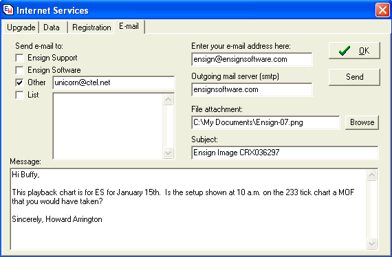
E-mail Charts:
When you are doing a playback on your own, feel free to e-mail me
the chart using Ctrl-E in Ensign. Check the Other box and
enter unicorn@ctel.net in the
window to the right of Other. After you have typed
your question in the Message text window, including the day you are
playing back, click the send button. It will say when
finished. Click on OK to close the e-mail window.
Remember the only 'stupid' question is the unasked one.
Also playback uses your current computer clock so please make
sure it is accurate. At http://www.dacharts.com/ under
links "Trader's Tools" are links to good Internet clocks. I
personally run the Dimension 4 clock in the morning and then close
it so it is not conflicting with my eSignal data feed.
Sim-Broker:
Use Sim-Broker will keep track of your trades by marking them on
the chart. This feature can be opened two ways. Use the
icon in the control tool bar - circle that is half blue and half red
- or right mouse click and click on Sim-Broker in the pop-up
menu. Whatever chart that is active when you open Sim-Broker
is the chart that will be marked with your trades. If
you are practicing with multiple contracts, Sim-Broker will also
note your open position on the chart.
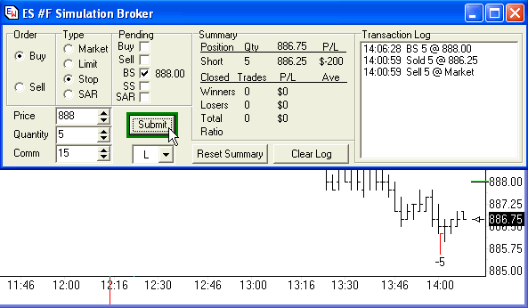
If you discover Sim-Broker is not working, it is usually because
it is confused by having been left open in the demo workspace and
"lost" the chart that it is trying to mark.. If you click the
Reset Summary button and the Clear Log button, close the Sim-Broker
window using the X in the top right corner and then reopen it
with the chart in focus you want your trades logged on.
Then, it should be working well.
If you wish to have a printout of your trades, just click on the
printer icon with Sim-Broker window active. The file created
for the day will be located in the \Ensign\Broker folder. If
you do more than one playback in a day, it is overwritten with the
last playback done when the Sim-Broker window is closed.
Please note there is no refresh available in playback. If
you wish to change a chart from day session to all sessions, uncheck
day session, save the workspace and then restart playback to fill in
the bars for all sessions.
To simulate real-time trading where fills aren't so fast, you may
want to increase the commission size in Sim-Broker to double what
your commissions really are.
Direct Feedback for how well you trade:
The following method was shared by Pam Danielson - Google- and I
have recommended it to many traders. It forces you to focus on
discipline and consistency versus points.
Trade with Sim-Broker marking the charts with your entries and
exits. At the end of the day, print the chart out.
Obtain a base number by going over the chart and seeing how many
setups that followed your rules were presented that you were at the
machine to take.
Now go over your trades. Give yourself one point for each
setup that followed your rules that you took. Subtract a point
for each setup that followed your rules that you didn't take.
Subtract a point for each trade that you took that did not follow
your rules. The closer the result is to your base number, the
better you did regarding discipline and consistency.
Other ways of measuring your performance are discussed in
the two Trading Plan discussions - http://dacharts.org/archives/Trading_Plan/
Trading Room Lingo:
MOF - Money on Floor - First Study Window - 2X
Window
Long term Stochastic has just
rolled over.
Usually there is a
spread between the %K and %D.
It is
the first touch of the opposite BB - Bollinger Band
SLING - in the first study window - 2X
window
Long term Stochastic is
relatively flat.
Short term
Stochastic pulls away.
While you are in
the trade, the Short term Stochastic sling back to the Long term
Stochastic
TMAR - Take the money and run
HH-LH-HL-LL - higher high, lower high, higher
low, lower low
HD - Hidden Divergence - also called Reverse Divergence and
Continuation Divergence. When I speak of HD I am referring to
the MACD Histogram. You might want to read the following link
on it: file:///C:/EnsignSoftware/tips/tradingtips31.htm
RD - Regular Divergence - per the article - again referring to
the MACD Histogram
Ribbons - these are the 4 colored lines in the bottom study
window - Bline Window.
Their
relationship to the Bline - the white/black line with the dots - is
what makes the patterns for setups,
While all of the discussions at http://www.dacharts.com/discussions.php
are well worth reading, the following ones may be referred
to
"Stops and
Exits"
"Steps to Success" part 1
and part 2
"Seven Deadly Sins of
Trading"
Playback:
A new pause button has been added in the January 17th
version. When you are running playback, it will appear to the
right of Help on the main menu. The button will only show when
doing a playback. If the button is SHOWING, that is your
indication playback is still running and that it is wasting CPU
power during market time. So, it will be a visual help or
indication as well that you would benefit to return to playback
window and uncheck the Enable box to turn playback OFF.
Uncheck the Playback Enabled box on the SetUp | Playback form when
markets are open. |