December 2003Article:
Ensign Map
by Howard
Arrington
"Can the markets be predicted?" That is a century
old question. The 1900 Ph.D. thesis dissertation of Louis
Bachelier, in Paris, argued the apparent erratic motion of stock
market prices is identical to random walks. The 1965 work of
Nobel prize winner Paul Samuelson proved that prices fluctuate
randomly. While the bias of academia is towards markets being
efficient, completely random and unpredictable, it appears that most
traders believe otherwise. Traders see market behavior and
price patterns that are repeatable, which therefore offer an element
of being predictable.
Larry Pesavento, a well know trader and author, has been a long
time proponent that market behavior can be predicted.
The titles of some of his books are: 'Astro-Cycles: The Trader's
Viewpoint', 'Fibonacci Ratios with Pattern Recognition', and
'Profitable Patterns for Stock Trading'. The last mentioned
book has a chapter titled 'The Non Random Nature of Chaos Theory'
which discusses his involvement in an area of research using Neural
Networks to forecast the next day's price action. Neural Nets
were discussed in greater detail in the January
2002 and August
2002 issues of the Trading Tips newsletter. A
profile of Larry Pesavento and his trading style is discussed in the
June
2002 Trading Tips issue.
I believe the markets can be predicted. Market behavior has
often been compared to waves because of the inherent characteristics
of amplitude and periodicity. Market technicians have used Fibonacci
retracement and extension tools to measure and predict amplitude
fluctuations. The Pesavento
Patterns tool was developed for Larry Pesavento to quickly find
the swings in the price action and label the amplitude ratio
relationships. Cycle
tools have been used to measure and predict periodicity. A
powerful tool that is predictive of both price and time is the Pyrapoint
tool.
Possibly the most original predictive tool in recent
years to be made commercially available is the Ensign Map tool found
only in the Ensign Windows charting software. The Ensign Map
tool analyses enormous amounts of market data to make a probable
forecast of future market behavior. The tool incorporates the
characteristics of both amplitude and periodicity to forecast future
price action. That is a monumental objective, and the
Map tool does an exceptional job.
The Ensign Map needs lots of back data in order to
make a useful prediction. The tool is designed to recognize
patterns and learn market characteristics for both vertical price
fluctuations and the timing of swing turning points. Time of
day is an important consideration since behavior at market open is
used to predict opening behavior. Mid-day behavior is used to
make a mid-day forecast. Behavior at market close is
used to predict market closing patterns. In order to see
sufficient pattern detail, it is recommended that the tool be
applied to 2-minute bars up to 5-minute bars. A large
time frame bar like 60-minutes is inappropriate because there is
hardly any pattern in just 6 hourly bars per day. Some users
have applied the Map tool to constant tick bar charts with success,
but the variable nature of the time period covered by constant tick
bars diminishes the precision of the Time characteristic that the
tool is analyzing.
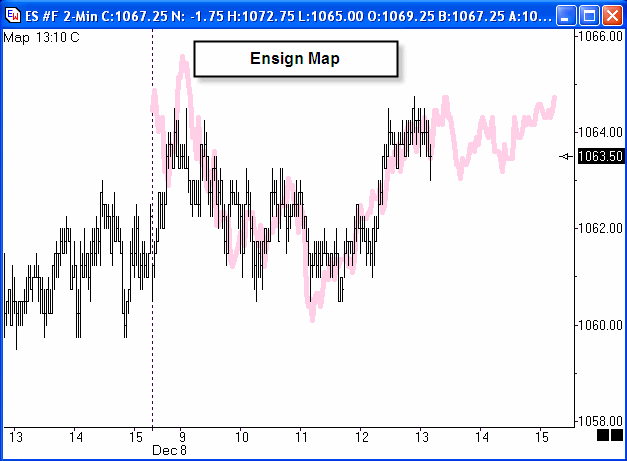
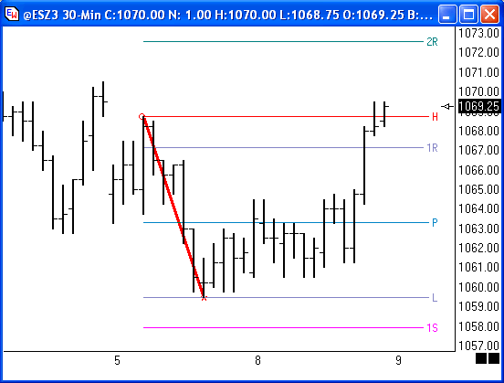
Market Open Forecast
Recalculate the Map at
the end of the day session. The Map that shows on the chart
will have very high correlation to the chart because it has the
benefit of hindsight. The data showing on the chart and all
prior days off the left side of the chart is known information, and
is used to make the forecast for tomorrow's opening behavior.
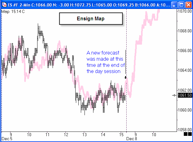
The forecast is for the market to move higher in the
first couple hours of the trading session. Here is what
actually happened.
The market started higher, but then sputtered sideways
in a 3 point trading range. This is hardly fulfilling
the previous day's forecast for the market to move upward to the
1069 price area.
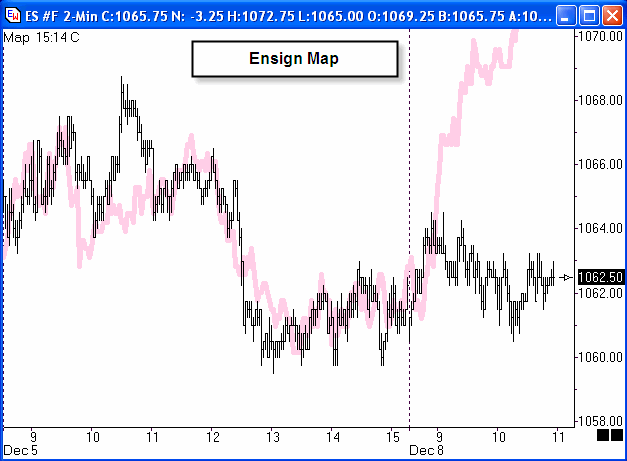
Mid-day Forecast
Now that new information
about the actual open is known, it is time to make a new forecast
for the mid-day. The Map is recalculated manually by pressing
the equal sign key.
The Map has been resized in its amplitude by pressing
the Shift Left Arrow or Shift Right Arrow keys. Then it was
repositioned vertically so it nicely overlays the chart's bar
pattern as shown. The Map is positioned vertically by
using the Shift Up Arrow or Shift Down Arrow keys. The
forecast is for another couple hours of sideways choppy
action. This is what developed through the mid-day.
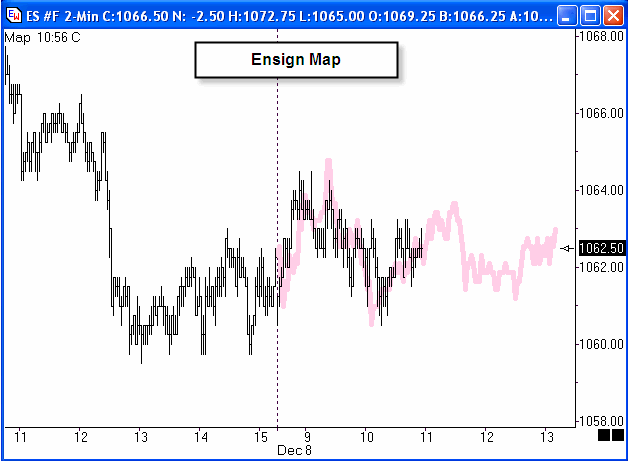
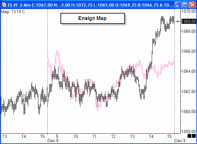
Late Afternoon and Closing Forecast
A couple
more hours of price action describing today is known. It is
time to make an update of the forecast to predict how the market
will behave for the balance of the afternoon and into the
close. The equal sign key is pressed to recalculate the
Map. The new Map is resized and repositioned to overlay
the chart bars nicely. The forecast for the balance of the day
is for more sideways action near the high of the day.
This is how the market actually closed.
The market rallied to the 1069 price after all.
Summary
The Ensign Map is a forecast based
on probability, not certainty. The examples illustrate
how the Map is used. Note that the time of the forecast is
shown on the chart in the top left corner. The time stamps
tells when the Map calculation was made. Data ahead of this
time stamp is known information. Bars shown on the chart
after the time stamp show how the market developed in comparison to
the forecast.
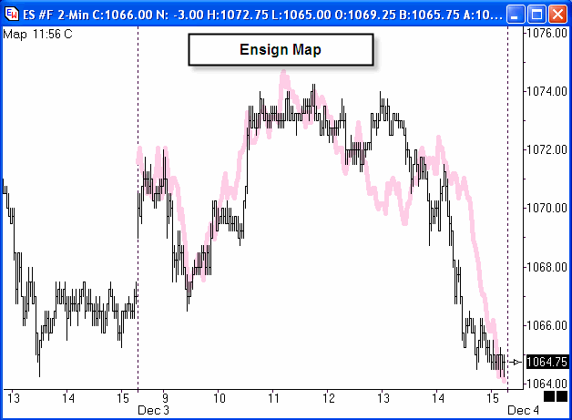
The examples shown in this article not particularly
impressive. Perhaps it is better that way lest hand picked
stellar examples give a false expectation about what the Map can
do. Some forecasts are truly phenomenal, however, such as this
forecast made at 11:56 on December 3rd for the market to sell off in
the afternoon and close on the low of the day. This Map when
sized to fit the bars ahead of 11:56 made an exceptional forecast of
the market's closing price.
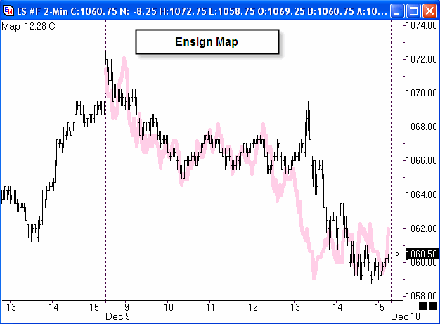
Here is another excellent example of a Map calculated
at 12:28 on December 9th forecasting the market to trade lower in
the afternoon and close slightly off of the low of the day.
The chart shows how the afternoon behavior developed. Again
there is good correlation between the forecast and the actual, and
the price where the market closed.
The Ensign Map is a regular feature on the charts
posted by Larry Pesavento in the TradingTutor chat
room.
Tool Tip:
Support and Resistance
by Howard Arrington
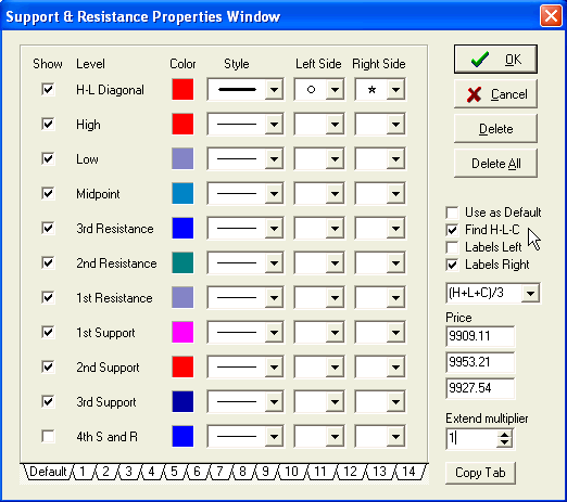
The Support and Resistance tool uses specified chart prices to
calculate Support and Resistance lines. The High, Low, and Close
prices of a daily range are often used as 3 input prices. To
apply the Support and Resistance tool on a chart click the Support
and Resistance button. The cursor will change to a pencil
while in the draw mode. Select the 1st point from a high point
(usually the High of a bar), then hold down the left mouse button
and drag to the 2nd point. The 2nd point should be the Low of
the bar or trading range. Release the mouse and then move to
the 3rd point. The 3rd point is the point where the market is
currently trading, or the Closing point of the range. Click
the left mouse button once to mark the 3rd point.
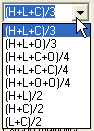
Place a check mark on the tools' property form in the 'Find
H-L-C' box to automatically find the Pivot value using the indicated
prices in the drop-down list box. The drop-down list box
allows you to choose a few variations on which prices to use for the
Pivot calculation. Make sure that you place a check mark in
the 'Find H-L-C' box if you want to use the prices indicated in the
drop-down list box. Example, if you select (H+L+C+O)/4 from
the listbox, the tool will auto-find these prices for you.
Support and Resistance lines are plotted based on the
calculated Pivot point. The lines indicate possible support
and resistance levels. Watch for support and resistance on the
lines. NOTE: The first 4 Support and Resistance lines can be
accessed by the Alerts Trading System draw tool.
Support
and Resistance Lines Formula
Pivot = (High Point
+ Low Point + Close Point) / 3 (example)
Range = High Point
– Low Point
4R [4th Resistance] = 2R +
Range
3R [3rd Resistance] = 1R + Range
2R [2nd
Resistance] = Pivot + Range
1R [1st Resistance] =
Pivot + (Pivot - Low)
H [Yesterday's
High]
P [Pivot Price, i.e.
Midpoint]
L [Yesterday's Low]
1S
[1st Support] = Pivot - (High-Pivot)
2S [2nd Support]
= Pivot - Range
3S [3rd Support] = 1S – Range
4S
[4th Support] = 2S - Range
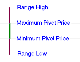
Pivot Price
The pivot price is always
contained within the range of the High and the Low points.
When the formula for the Pivot is (High+Low+Close)/3 then the Pivot
will be in the middle third of the High-Low range. The highest
pivot price would be when the Close is at the High, wherein the
Pivot is at 66.7% of the daily range. The lowest pivot
price would be when the Close is at the Low, wherein the Pivot would
be at 33.3% of the daily range. The following
illustration shows the maximum extremes of the pivot price for the
oft used formula of Pivot = (H+L+C)/3.
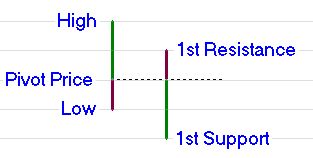
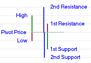
1st Support and 1st Resistance
The 1st
Support and 1st Resistance levels are created by inverting the daily
range vertically about the pivot point. I guess that is where
the pivot point gets its name. This illustration shows the
effect of pivoting the 1st bar which is shown in two colors to
illustrate the part that is above the pivot and the part that is
below the pivot. The 2nd bar is the 1st bar inverted about the
pivot point, and it shows where the 1st Support and the 1st
Resistance levels come from.
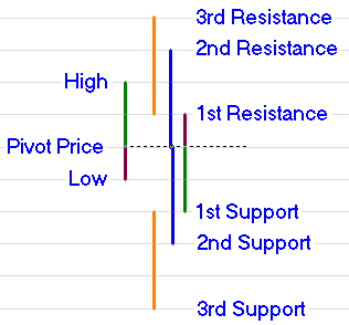
2nd Support and 2nd Resistance
These two levels are
calculated by adding the daily range to the pivot price and
subtracting the daily range from the pivot price. The daily
range is shown graphically as the vertical blue lines above and
below the pivot price.
3rd Support and 3rd Resistance
These two
levels are similar to the 2nd S&R levels. The daily range
is added to the 1st Resistance level and subtracted from the 1st
Support level. The graphical illustration of this is shown
using the orange lines to measure the daily range.
Other Formulas
There are other variations of
the above theme for calculating Support and Resistance levels.
The most common variation is to use a different formula for the
Pivot Price. Ensign Windows supports the following variations
through the use of the drop down listbox to select the Pivot Price
formula. The most commonly used formula for the Pivot is the
(H+L+C)/3 selection.
Other formula may look different that what has been
presented in this article. More often than not, algebraic
rearrangement of the formula terms simplify the formulas to those
given in this article. |