September 2004Trading Tip:
Heikin-Ashi Explained
by Howard Arrington
The February 2004 issue of 'Technical Analysis of Stocks and
Commodities' magazine contains an article by Dan Valcu titled 'Using
The Heikin-Ashi Technique'. Too often traders hear about a
technique and think the 'holy grail' train is leaving the station
and they rush to get on board without taking time to understand what
it is all about. The purpose of this article is to comment in
greater detail on the visual presentation created by the mathematics
of the method.
Mr. Valcu says that 'heikin' in Japanese means 'average' and
'ashi' means 'bar'. So a literal translation would be 'average
bar'. Indeed, the method employs an averaging technique
as follows:
- haClose = (Open + High + Low + Close) / 4
- haOpen = (haOpen(previous bar) + haClose(previous bar))/2
- haHigh = Maximum(High, haOpen)
- haLow = Minimum(Low, haOpen)
Now for those who have pulled out the Valcu article and compared
his formulas with those given above, please do not be too quick to
claim that I made a mistake in plagiarizing the formulas. My
formulas are equivalent and it represents one of the criticisms I
have.
haHigh and haLow
Mr. Valcu's formulas in the article were give as:
- haHigh = Maximum(High, haOpen, haClose)
- haLow = Minimum(Low, haOpen, haClose)
It is mathematically impossible for the haClose to be
higher than the bar High, or lower than the bar Low.
haClose is an average of the bar's open, high, low and
close. The open must be in the high-low range. The
close must be in the high-low range. The low must be
equal to or lower than the high. Therefore, the haClose can
never be higher than the High, nor lower than the Low.
Because the haClose can never be higher than the High, the
Heikin-Ashi High does not need to test for the haClose as a possible
price that would set haHigh. Choosing the higher of High
and haOpen is sufficient. The same reasoning applies to
picking a price for the Heikin-Ashi Low. Choosing the
lower of Low and haOpen is sufficient. haLow does not need to
consider haClose because haClose will never be lower than the
Low.
I consider it unfortunate that Mr. Valcu did not understand these
principles before he published his article. And, every
programmer who published script code to implement Heikin-Ashi in
their charting package used the Valcu formulas with scripts similar
to this example:
- haHigh = MaxList( H, haOpen, haClose);
- haLow = MinList( L, haOpen, haClose);
Not one of the twelve programmers who published scripts in Stocks
and Commodities magazine pointed out that testing for haClose is
unnecessary because it is an impossibility. It
does not hurt to test for it, but it is an unnecessary step.
Missing something obvious like this makes me wonder just how much
serious thinking is being made to understand what this technique is
all about. Now, let's leave that issue and continue with
the analysis.
haClose
The Heikin-Ashi Close is the average of four bar prices:
open, high, low and close. This creates an interesting
effect in strongly trending markets which I feel is misleading for
chart readers. Let me illustrate the effect with the following
example.
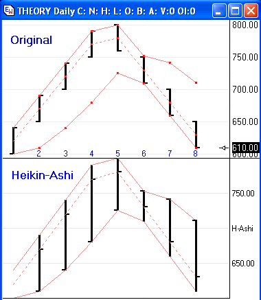
The example shows the original bar data in the top
half of the chart, and the Heikin-Ashi method in the bottom
half. Ensign Windows was used to prepare the examples.
Bars 1 through 4 are strongly trending up, and bars 5 through 8 are
strongly trending down. Now permit me to point out several
things by comparing the two images.
The Heikin-Ashi data points are also shown on the
original chart using small red dots, connected by solid red lines
through the highs and lows, and a dotted red line through the
closes. These dots and lines will aid in the comparison
of what Heikin-Ashi is doing to 'average' the original bar data.
In an Up candle the haClose will always be below the
actual close, and in a Down candle, the haClose will always be above
the actual close. These two principles are illustrated by
comparing the position of the close red dots to the bar closes in
the Original chart image. In fact, haUp candles will ALWAYS
have a high wick, and haDown candles will ALWAYS have a low
wick. This is a built in behavior that may surprise most
Heikin-Ashi candle readers. It is one of the primary areas I
feel is misleading.
Note: haUp candles may or may not have a low
wick. haDown candles may or may not have a high wick.

A wick on the top of a regular Up candle implies that selling
pressure has moved the market back down from the high. Thus, I
consider it misleading to see a high wick on a Heikin-Ashi up candle
when no selling pressure is present. The inverse applies
to low wicks. A wick on the bottom of a regular Down
candle implies that buying pressure has moved the market off of the
low. Again, it is misleading using conventional interpretation
for low wicks to be present on a Heikin-Ashi down candle when no
buying pressure is present.
Mathematically the haClose can never exceed 75% of the original
bar's range. 75% would be achieved when the Open and the Close
occur at the extreme of the bar's High. In that case,
haClose = (H+H+H+L)/4. Simple example: O=4,
H=4, C=4, L=0, so haClose = 12 / 4 = 3 So
the maximum haClose value is 3/4th of the range because the range
was 4. Thus the high wick size in an Up candle will be
25% of the original bar range or greater. The low wick
size in a Down candle will be 25% of the original bar range or
more.
In the Chartpoint Magazine, No. 12 (2003), Yashuji Yamanaka gives
five rules for trading the Heikin-Ashi charts. His Rule 2
reads, 'Positive candle with upper shadow means "strong BUY"', and
'Negative candle with lower shadow means "strong SELL"'. I
have proved out that every haUp candle must have a high wick, and
every haDown candle must have a low wick. Therefore, Rule 2
would have EVERY Heikin-Ashi candle be either a 'strong BUY' or a
'strong SELL'. This obviously is not the case, so I must
conclude that Yamanaka's Rule 2 is an illogical statement.
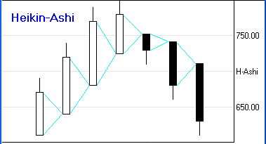
haOpen
The haOpen formula can be stated more simply as the midpoint of
the prior Heikin-Ashi bar's candle body. See the graphical
illustration of this where the cyan lines from the prior bar's
candle body range point to the candle body midpoint. This
midpoint is used as the open of the following Heikin-Ashi bar.
The haOpen can be outside of the original bar's
range. Therefore, the range of the Heikin-Ashi bar is extended
to include the haOpen price. This extension is done by
choosing the higher of High and haOpen for the haHigh, and the lower
of Low and haOpen for the haLow. Mr. Valcu describes this
process as eliminating 'irregularities from a normal chart', and
creating a 'better picture of trends'. My opinion is that this
process is creating misleading perceptions. Let's look again
at the example.
One misperception in the Heikin-Ashi chart is the
absence of gaps. There are 6 gaps in the original chart
and they have all been 'averaged' out of the picture. If gaps
mean something to you either as an indication of momentum or a price
level that will eventually be filled, you will have to do without
that insight when you use Heikin-Ashi charts.
Another misperception in the Heikin-Ashi chart is the
length of the bars. In our example many of the HA bars are
twice as tall as the original bars. HA bars will always
overlap a portion of the bar on its left-hand side. In the up
trending portion of the example, the HA Lows are all lower then the
original lows, giving the impression the market traded at prices
during that time period when no such trading occurred.
As an example, consider bar #3. The original bar price range
is from 700 to 740. The Heikin-Ashi bar implied that
during the #3 time period, the trading was from 640 to 740.
That is misleading. The visual presentation does not make any
differentiation between the portion of the range that is actual and
the portion that is invented.
Another misperception is the combination of bar #4 and
bar #5. On the original chart, these two bars make a formation
known as a Key Reversal Pair. That significant information is
totally lost in the Heikin-Ashi chart. In fact, bar #5 on the
HA chart is shown as an Up candle which is 100% opposite what
actually happened. That too is misleading in my opinion.
Summary
I guess by now you have concluded I am not overly
impressed with the Heikin-Ashi method. It may be serving a
beneficial purpose for many of you, and if so, that is
wonderful. I encourage you to continue using what works for
you. Heikin-Ashi charts are included in Ensign Windows because
users asked for it. But, I do not know if it is going to help
anyone trade more profitably. Seasoned trader Ira Tunik
recently stated, 'There are those that are constantly looking
for the Holy Grail and [think] every new or revived study or tool is
necessary. Over the years I have found that the majority of
the exotic, complicated and supposedly new studies don't help
anyone's trading ability or profitability.'
Whatever the case may be, at least by reading and
understanding the points made in this article you will be using the
Heikin-Ashi method better informed about how it is creating 'average
bars'.
Trading Tip:
Aroon Indicator
by Jay
West
Recently a new indicator was added to Ensign Window’s study
list. It is called the Aroon indicator. The indicator is
supposed to allow you to anticipate changes in price from trending
to trading range. At first glace the indictor looks very
complicated and seems to make no sense. With a little time,
education, and experience I have found it to be most enlightening.
The description of how the indicator works is fascinating
stuff. It 'measures the number of periods that have passed
since the most recent x-period high and x-period low.
Therefore, the Aroon indicator consists of two plots; one measuring
the number of periods since the most recent x-period high (Aroon Up)
and the other measuring the number of periods since the most recent
x-period low (Aroon Down).' Now I am almost sure that most of
the people reading this article are just eagerly awaiting a further
discussion of how the indicator is plotted in a Stochastic like
scale etc, etc, etc. Yeah sure. Just in case you are
really interested, a more complete discussion of the indicator can
be found on the Internet using a Google search.
We are traders, and as such it is extremely important to know how
to use indicators to our advantage. I have never felt the need
to be thoroughly educated on how the thing works. Just give it
to me and let me play with it long enough and I will either make it
work or throw it away because it is impossible to figure out. Right? Ok, I have been
playing with the Aroon for a few days and I think I have figured out
a way to use it which I will share with you.
As you can see below the Aroon consists of two lines. One
red (the Up line), and one blue (the Down line). In the system
description there is a discussion about three thresholds.
Those being the 70, 50, and 30 thresholds. I have discovered that if I
pay attention primarily to the red line’s relationship to these
thresholds I can determine what the market is telling me about
trend. It also begins to become clear that I can use this
indicator to trade. In fact I can almost make a complete
system out of the indicator.
Rule #1: If the red up line goes to the top of the
range (Window) there is a possibility of an up trend beginning. If the red up line stays
generally between the top of the window (100) and the 70 threshold
marked by the orange line on the example chart, the up trend is in
motion. The closer it remains to the top the stronger the
trend.
Rule #2: If the red up line retraces to and breaks
through the 50% line (red dashed line) the trend is in serious
trouble. If it reaches the bottom of the scale/window, the
trend is usually dead and a down trend may be beginning.
Rule #3: If the red and blue lines separate
and remain separated the trend is strong and I aggressively add
contracts on price pull backs.
So, in summary, what we have is a strong trend if the red line
goes to the top and stays there, a failing trend if it pulls back to
the 50% threshold and a possible reversal into a down trend if it
falls below the 30% threshold. The reverse is true for a down
trend. If the red line breaks up through the 50% line the down
trend is weakening, etc.
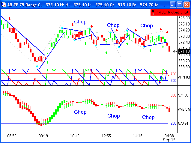
So how do we trade this thing? I have discovered that if I
merely watch the relationship between the red and blue lines I can
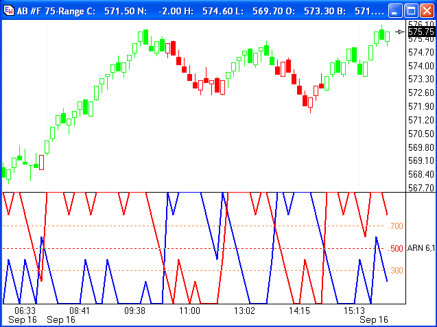
use their crossovers for entry and exit signals. Look at the
chart below which I have marked up with arrows for the entries to
trades. This is real data for Sep 16th and the
trades worked as advertised. The day produced overt 10 points
in the AB. You can see that the red line races to the top
immediately after the opening, crossing the blue line in the
process. That crossing of the blue line is a long entry.
Then the red line stays generally above the 70% threshold and the
price continues to rise. Note how the red and blue lines
are separated through most of the up move. That indicates a
strong trend in progress and I would buy more contracts as the price
pulls back and hooks.
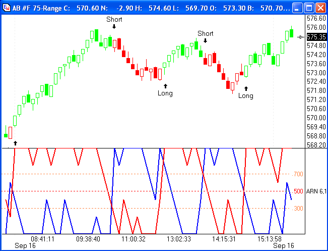
When the red line breaks the 50% line you can remove at least one
contract if you are trading multiple contracts and if you are trading a single contract, go flat with the
crossing of the 50% line. In the example chart, you’ll notice
that the red line again crosses the blue line on its way to the
bottom of the window. You can sell that crossing and go
short. As long as the red line stays below the 50% line you
can stay in the short trade.
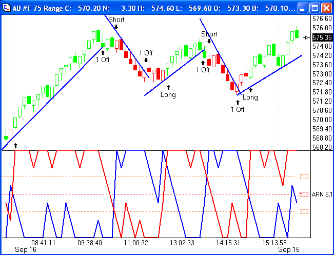
That’s it in a nut shell for the Aroon indicator. I do a
couple of other things to help with entries and trade
management. Look at the chart below and you can see I have
placed the new auto trend lines, recently added to the Ensign
program, on the chart example. I think you can see that it is
very beneficial to have these on the chart. I trade multiple
contracts and I use the Trend lines to 'take one off' when the price
closes on the other side of a trend line and I reverse the trade
when the Aroon red line crosses the blue line, which when it happens
correctly, occurs quickly after the trend line break by the
price. Obviously you can reverse the trade if you wish on the
trend line break, but I have seen those trend lines do a nasty
little adjustment thing on occasion and that’s not fun to get caught
in one of those, so I generally wait for the Aroon to confirm the
Trend line break and reversal. It is considered aggressive
style to reverse the trend line breaks and you may get whipsawed
more often doing that than waiting for the Aroon.
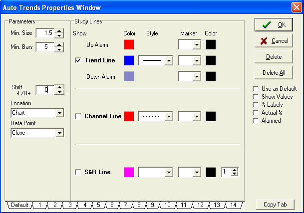
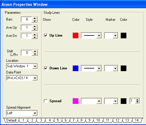
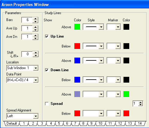
I have included some properties windows for the Aroon. The basic
settings are shown there. As you can see there is a capability
to put an “above and below” setting on the red line thus making it
turn green when it is above the blue line and red when below
it. That is the second
Properties Window shown below. That makes it easier to manage
your trade. Simply try to be long when it is green and short
when it is red.
There will be times when you should stay out of the market.
Those times are when it is chopping. Look for the price bars
to go horizontal and the lines to cycle rapidly with the red and
blue lines crossing frequently. You must avoid this type market with
the Aroon system. The Aroon becomes a virtual whipsaw machine
in those circumstances. There are many methods to identify
chop. The action of the 'Average Bars' is a good way to
spot and avoid chop.
When the market is moving normally this system will catch all the
winners and cut losers fairly quickly due to the action of the Aroon
and the price action around the trend lines. I use a 0.75
range chart to trade with this indicator. I’m sure other time
frames will work with the Aroon but the settings should be tailored
to the time frame. Give it a try and see if you like it.
A template named the AroonSystem can be downloaded from the Ensign
web site.
I hope this clears up some of the confusion that many seem to
have concerning this great indicator. Good trading to all.
Education:
Stock Option Model -
September
by Howard Arrington
This is the September update of the paper trading model based on
Bill Hatch's July article Straddle-Strangle-Swap. Last
month I defined the scope of this project, and promised to
publish an update each month for the rest of 2004.
The model is selling near term options in Dell Computers (DELL),
Home Depot (HD), Office Depot (OPD), and Disney (DIS), and
holding longer term options as an insurance policy. The
plan is to execute a calendar roll-out each month by buying back the
short options on the day before expiration, and selling short
options one month out. The roll-out of replacing the
September options with October options was carried out on Thursday,
September 16th, 2004. The October roll-out will be carried out
on Thursday, October 14th. This is where the model stands.
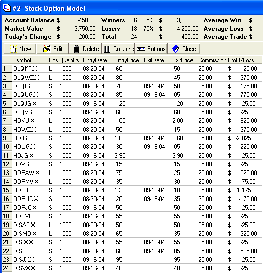
A desirable characteristic is for the stocks to be tracking
sideways. This was the case in the past month for Dell,
Disney, and Office Depot. The stock that trended was Home
Depot, possibly benefiting from increased demand for building
materials because of the three hurricanes.
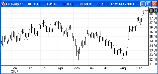
The short HDIG Call at $35 is the trade that was a
costly $2000. The model will resell the same strike in the
October month with the expectation that Home Depot prices will
return to a more average price.
Summary:
-
Dell: - 125 - 375 + 175 + 775
= $450 net gain
-
HD: + 975 - 375 - 2025 +
225 = -$1200 net loss
-
ODP: - 525 - 75 + 1175 - 175
= $400 net gain
-
DIS: - 25 - 325 - 25 + 525
= $150
net gain
|