October 2005
Trading Tip:
Trading with the Virgin POC
by Michael Jardine
In this article I will discuss three topics: The Price
Histogram study, the Virgin POC option for that study, and a method
for trading with the Virgin POC that I call the Universal
Method. You can see a record of recent trades here: http://www.enthios.com/blog.htm
Price Histogram
The Price Histogram is my favorite tool for two reasons: It
is intuitive, and it is extremely effective. There is no hocus
pocus or mathematical wizardry; no need for exponentials, or
smoothing, or weighting. The Price Histogram simply shows you
what you should be able to see with the naked eye: where the market
was most "comfortable" trading, over any given period. It is
also rare among technical indicators because it is leading, not
lagging. It is a leading indicator because it tells you, quite
far in advance, where the market is likely to turn. Moving
averages and oscillators cannot predict; they can only suggest, and
never in advance, that the market is overbought or oversold.
Lagging indicators are also notoriously bad at keeping you out of
sideways chop.
Traditionally, the Price Histogram study (or others, sometimes
referred to as a Market Profile) has been applied to a 30-minute
chart to provide a histogram of market activity for one day.
Unless I am looking far back in time, I prefer a 5-minute chart
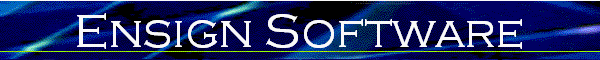
because it is more precise. The chart below shows a 5-minute
Price Histogram study.
The histogram on the left side of the chart is drawn during the
day in five-minute increments. The length of each
horizontal line in the histogram represents the amount of time that
the market spent at that corresponding price. Thus if the
market spends a great amount of time at a particular price, the
histogram line for that price will be longer. The longest line
in the histogram is the one price where the market spent the most
amount of time. It is called the Point of Control or, alternatively,
the Control Point. Most traders refer to it as the 'POC' for
short.
In this chart, you can see that the POC lies at 1183.
The beauty of the Price Histogram is that even if it was not there,
you could probably still look at the chart and guess that the most
amount of time was spent in the region of 1182~1184.
What is significant about the POC? Traders collectively
remember it, consciously or subconsciously. That's all.
No math needed. And the more time that the market trades at a
particular price, the longer - or greater - that memory.
Psychologically, the POC acts as a center of gravity. In this
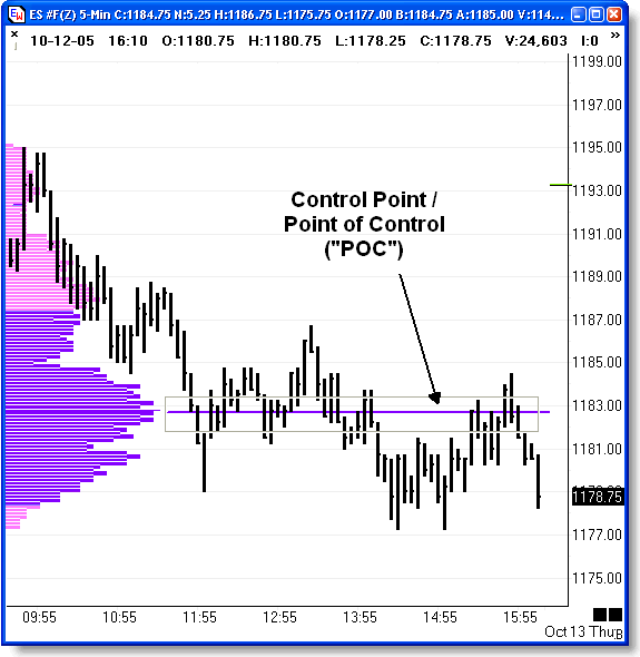
chart, the POC for October 12, 2005 was 1183. Let's scroll
down and look at what happened on both the day before, and the day
after, October 12.
This next chart shows what happened on the day before, and after,
October 12. It is an excellent, albeit ideal, illustration of
the power of the Price Histogram. Don't worry. I will
also show you what can go wrong.
The POC on 10/11 was 1193. Even without the
histogram and the POC line, you should be able to see that the
market spent most of the day in the 1191~1193 band. At the end
of the day, the market closed almost 5 points below the POC.
Overnight it gapped down slightly but then, for whatever reason,
started to head back up. It is important to recognize that we
cannot predict whether the market will go up or down. We can
only be reasonably sure that as the market moves closer to a POC
line, the gravitational "pull" of that line increases. What happens
when prices hit the line? The same that happens to any object
with weight when it comes into contact with the source of gravity:
it bounces. If it bounces hard enough - as in a tennis
ball hitting a tennis racket - it will return very quickly from
whence it came. On the morning of October 12 you can see that
the market moved back up to touch the previous day's
POC. Bullish traders tried to push it beyond, but not
for long: that is the strength of the POC. This also
illustrates that the POC is not exact; most people familiar with
price action are aware that when prices reach a turning point - be
it a previous high, low, or congestion range - that point usually
will not act as an exact ceiling or floor. What happens at
that point depends very much upon the players in the market at that
point in time, and that means that what happens is random.
Some traders may try to move the market higher by
buying. If the collective "will" of the market is in
agreement, then the market will move past the POC. This
does not happen often. Because it does not happen often,
astute traders can turn that knowledge into a profitable trading
system. That is exactly what I have done.
What usually happens instead is that the market may try to move past
but then the buyers will dissipate, and sellers will take over.
Notice in the above chart that the exact same event occurred on
October 13. The market closed below the POC, then moved back
up the following day. When prices hit the POC, buyers turned to
sellers and the market turned back down.
Point of Control Formation
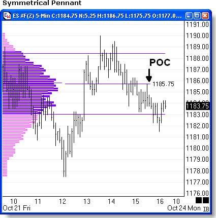
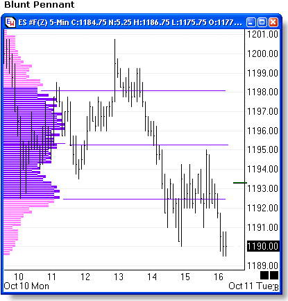
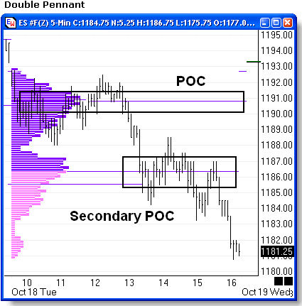
The histogram tends to form a bell curve, although it is not
always symmetrical. Because it is "turned sideways", it
more closely resembles a pennant. If the pennant has a sharp
"tip" protruding off to the right, that indicates that prices traded
for a long time in a relatively limited range and so the
"gravitational pull" of the resulting POC will be quite
strong. If the pennant has a blunt tip, then the POC is
not well defined and should be treated accordingly. Sometimes
a pennant can have two tips, one just slightly lesser than
the other. In this case, although the indicator only shows one
POC, there are two POC's. Therefore it is helpful to pay
attention to the actual shape of the histogram and draw your
conclusions accordingly.
 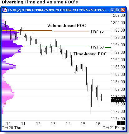
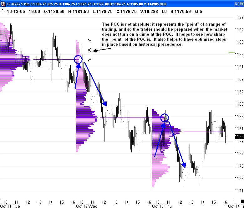
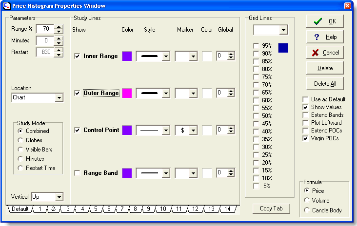
In the Properties
dialogue box shown below, the default setting is for a Time based
profile. There are options for Volume-based, and
Candle-based. Typically the Time and Volume based profiles
generate POC's that are almost exactly the same. You can check
this by running two overlapping studies, one for Time and one for
Volume. I usually do not show the histogram on the second study,
only the POC. In those cases where the Volume-based POC
is different from the Time-based POC, I will consider both as
viable.
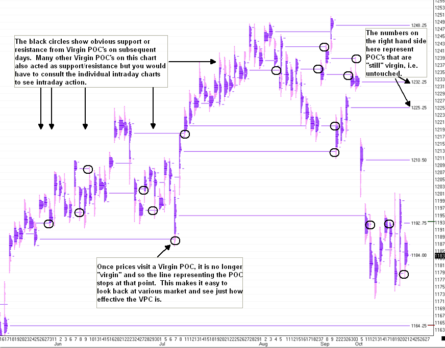
The Virgin POC
A 'Virgin' POC is one that has not been touched by prices on
subsequent days. It is a term that I came up with but its
significance was first brought to my attention by a friend, Jim
Swartz, who some of you may know as NQoos. The logic is
simple: as described above, a POC acts as a center of gravity for
the market. As prices move towards a POC, its gravitational
pull becomes greater. Two things happen: the likelihood
of prices moving towards that POC increases, and the likelihood of
the market bouncing, or reversing, at that point increases.
But what happens after prices hit the POC, retrace, then move on
through? In that case, the POC is no longer virgin.
Psychologically, the market no longer sees it as a significant
support or resistance pivot. Traders may still see the prices
that originally formed the POC as a congestion zone, but they will
also note that prices moved through that congestion, and so it has
been 'broken.' It is no longer virgin. It is less
dependable as a turning point. Again, there is no hocus pocus
to this; it is just simple common sense.
The 'Virgin POCs' option in the Price Histogram study draws the
POC line to the right until such a time as it is visited by prices,
at which point it is no longer Virgin. The significance of the
Virgin POC (or "VPC", as I call it) is shown clearly in the
30-minute chart (below) that shows the Price Histograms for each day
over the past five months.
The black circles show where a VPC clearly and obviously acted as
a price attractor and reversal point. In addition, many other
VPC's on this chart also acted as support/resistance but you would
have to consult the individual intraday chart to see the price
action. In the next section, we will look at several examples
of intraday action relative to a Virgin POC from a previous day.
The Universal Method
So how can we trade with this knowledge? If prices move up
toward a Virgin POC from below, you could simply short the
VPOC. If prices move down toward a Virgin POC from above, you
could simply buy the POC. I am a bit more cautious. I
look for confirmation from lagging indicators. In this case,
it does not hurt that they are lagging indicators, because they are
used to confirm a leading indicator. For this I use an
oscillator. It really does not matter which oscillator you
use: MACD, CCI, RSI, and Stochastic will all tell you when the
market is overbought or oversold, or at least when it is beginning
to 'turn.' Of course, they will not tell you with
any confidence whatsoever, whether the market will actually
turn. That confidence comes from the Virgin POC.
I use a stochastic as my oscillator. Rather than using the
cross of the %K through the %D line, instead I look at the %K
lines on two separate stochastic studies: a very slow one, and a
fast one. I use 81 as the moving average for the slow
stochastic, and 9 as the moving average for the fast
stochastic. When the slow stochastic is above the 65 band,
then a cross of the 9 stochastic from above signals a short.
When the slow stochastic is below the 35 band, then a cross of the 9
stochastic from below signals a long. 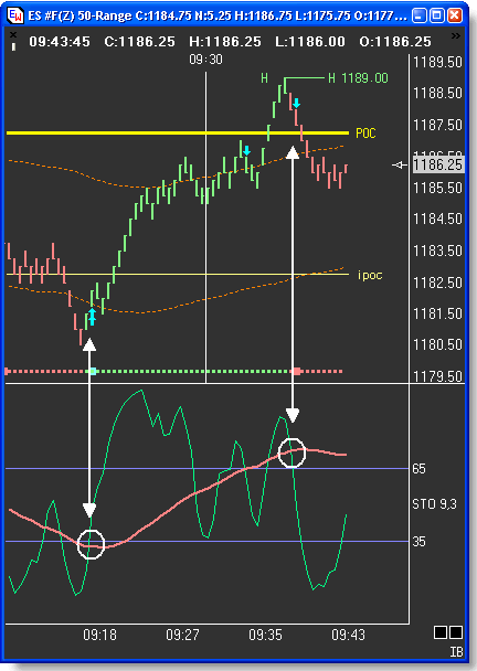 This next
chart shows a full oscillation of the slow stochastic, and the buy
and sell signals generated by crossed of the fast one. This next
chart shows a full oscillation of the slow stochastic, and the buy
and sell signals generated by crossed of the fast one.
I have created an Alert Study that places an arrow on the chart
and generates a warning sound, whenever the fast stochastic crosses
the slow from below and the slow is below 35, or when the fast
stochastic crosses the slow from above and the slow is above
65.
To understand how I combine the Virgin POC with two
oscillators, let's walk though a trade that occurred recently, on
October 20. As with all of my trades, these were posted, and
time stamped, to my web site as they occurred.
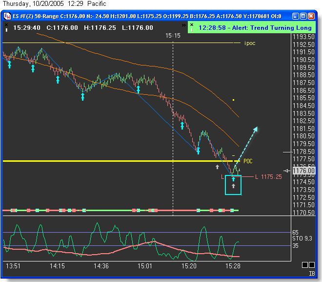
On October 20, the S&P E-mini opened at 1197.75. The
next chart below shows what I call the "Natural Trading Range"
(NTR): bound by a Virgin POC above, and a Virgin
POC below, the open price. It was posted at the beginning of
the day, as a sort of "road map" for the trading day. We have no
idea whether the market will go up or down. We only know that
as prices approach ONE of the two Virgin POC's, that VPC will act as
a price attractor and will pull prices towards it. Will prices
be pulled all the way to a VPC? Maybe. Maybe not. We may
have to wait two days. All we know is that if prices touch a VPC,
then look at the lagging stochastic oscillators to confirm trade
entry. Our leading indicator, the Natural Trading Range
created by the Virgin POC's, tells us we will either look for longs
in the 1178 area, or for shorts in the 1211.25 area.
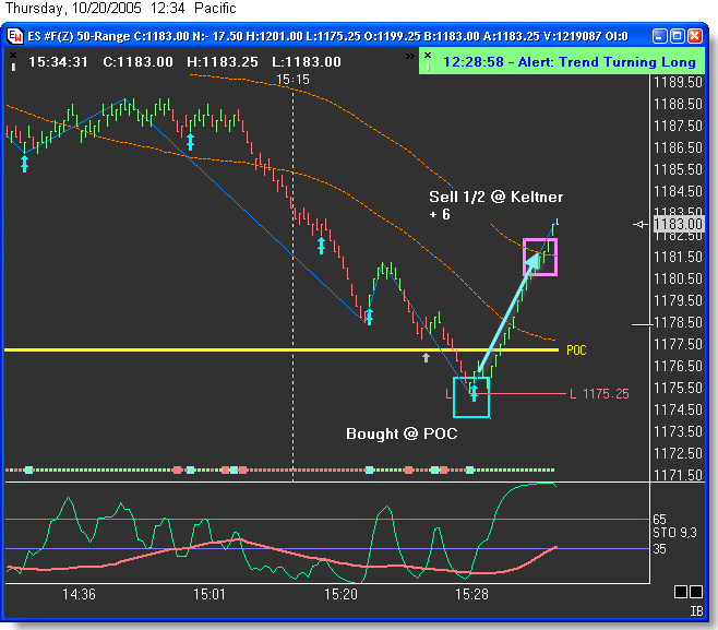
It was not until 3:28 pm that prices finally hit the
VPC below. When prices hit the VPC, I did not go long.
Instead, I checked to see that the slow stochastic (pink) was below
35. Then I waited for the fast stochastic to cross up.
That was my signal to go long. The dotted line shows the
intended direction of the trade.
I tend to be conservative, so I use various trade
management techniques. One is to observe the Keltner bands.
Keltner Bands are simply a moving average of the average trading
range. They tell you when prices are within the average range, and
when they are outside of it. For me, it is common sense that
when prices move to the other end of the average trading range, I
should take at least half of my profit there, as shown below.
This was a quick trade; six points in six minutes.
I then look to exit the remaining amount when the slow stochastic
has reached above 65 and the fast stochastic crosses down,
generating a sell signal. Note I only use this to exit the
trade. I would not take a short unless it was at a VPC.
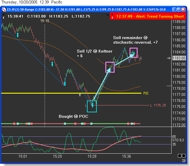
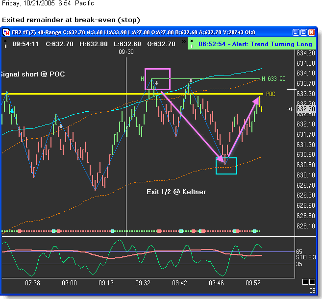
Trade management is also important. Once I take a profit on
the first half at the Keltner band, I will move my stop to
break-even. The following trade illustrates how the break-even
stop comes in handy:
That is the Universal Method, in a nutshell. Of course, the
astute trader will employ judicious trade management. It pays
to keep a record of all trades, and not just the trades, but what
happens during a trade: the high point and low point, as well as the
time of day, the Keltner band touches, and anything else that is
relevant. With this information organized in a spreadsheet,
you can optimize both your stops and your targets. You can
also determine which times of day are most effective, and when not
to trade. You can also determine whether certain days of the
week are less effective than others. Knowing where the optimum
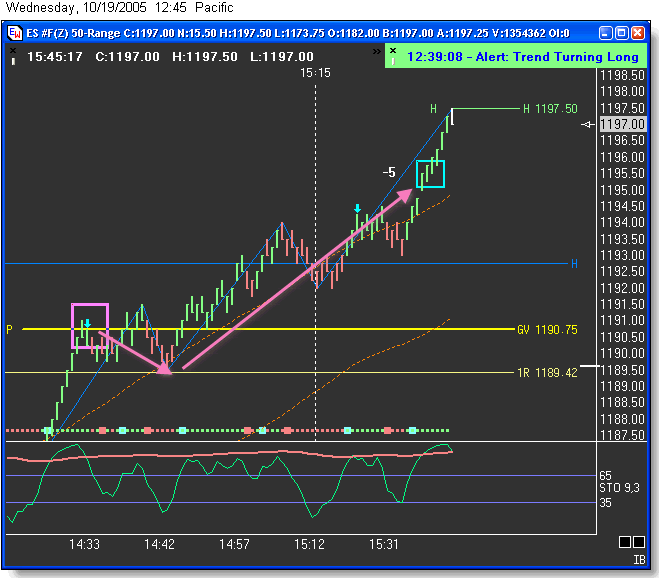
stop lies is very important. Here is an example of the
practical application of this knowledge:
Trading Tip:
The Narrow Range Bar
A Study of Market
Moods
Ó 2005
al_gorithmThe Markets Live
It is said that markets have personalities. I agree, but
feel it’s more helpful to think of markets having mood swings.
It also helps to view markets as living, breathing entities with a
personality akin to someone with a bipolar condition. The
markets rest and are at peace, then suddenly erupt and run in one
direction until they exhaust themselves, then rest again.
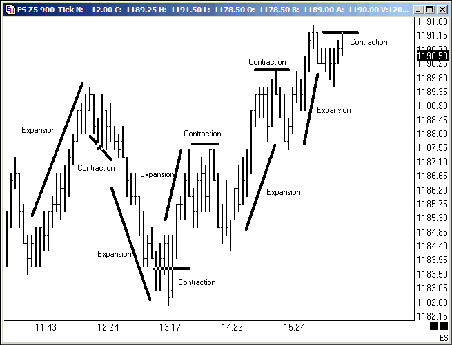
Technically speaking, markets move from periods of range contraction
to range expansion, and back again.
As The Market Turns
The mind of a trader cycles from the analytical phase, searching
for potential, to the stalking phase, and once a trade is opened,
back to the analytical phase to determine when the trade should be
closed out. Whether scalping ranges or trend trading, it is
important to be able to identify turns in a market. Measuring
the range of individual bars can help.
The range of a bar is defined as the difference between the high
and the low. A Narrow Range (NR) bar is a price bar with the
smallest range of all the bars in the look back period. With
the correct settings applied to the proper timeframes, flagging
these bars can be very useful for identifying turning points.
Chasing a market that has already turned and is in the range
expansion phase is difficult and dangerous. It is certainly
less profitable and higher risk than catching a market right at the
turn. But of course, most traders shudder at the thought of
catching market turns or 'picking tops and bottoms.'
All that is required to catch market turns is keeping in mind a
fundamental concept about price action: Range
Expansion follows Range Contraction. So with that
rule firmly anchored in your mind, you tune the tools you already
know and are comfortable with to the price action to help identify
high probability setups. And finally, you develop entry
techniques and a money management strategy that minimizes drawdown
when external market forces move the market contrary to the signal
given.
This article is about using one tool, the Narrow Range Bar
flag. It can help identify market turns and will compliment
any trend or range trading system.
How To Incorporate NR Bars Into Your Trading
To get used to seeing and identifying NR bars I would recommend
applying the study to your larger timeframe charts and just
observing them for awhile. Continue using what already works
for you and see when the NR bars compliment the setups you already
use. They can be used as a stand-alone setup, however you
should already be competent at reading price action before you
attempt to use them this way.
Ensign NR7 Properties
The most popular NR Bar setting is 7, followed by 4. My
back study work has confirmed that 7 is the best compromise between
getting a signal too early or late. However, you really should
experiment and determine this for yourself so you’re comfortable
with the setting.
The NR bar flag is an option within the Donchian Channel
study. You will need to apply it to your charts first and then
open the Donchian Channel properties window.
The first property window displayed below shows how to apply the
study as an NR7 paint bar. (This is the preferred method
because your eye needn’t move off the bar under construction to see
what’s happening. The less a trader needs to focus on and
think about during the day, the more efficient the trader will
be.) The bar paints the unique color selected in the marker
color panel, if it’s an NR bar. Typically, all bars open as NR
bars, but as the bar range expands the bar will change to the normal
color. If you use multiple paint bar studies, make sure the NR
bar study is last in the objects list, otherwise, it will be
overwritten and never paint.
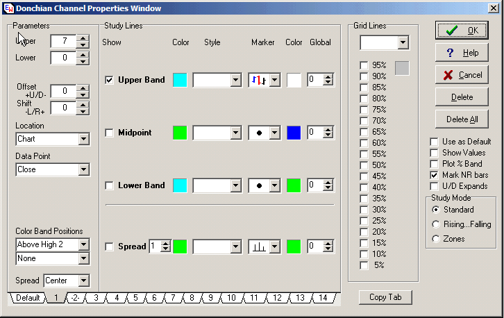
The second properties window shows how to apply the
NR7 bar study as a marker. It may be necessary to use a marker
if you use multiple color bar studies, as some studies won’t allow a
second color bar study to over paint it.

The Art (or Science!) of Identifying Market Turns Using NR Bar
Studies
If you are familiar with the Candlestick chart analysis, you will
remember the admonition given by Steve Nisson that not all
Candlestick patterns are signals all of the time. For example:
a doji is only important at extremes. In the middle of a range
bound market, doji’s appear frequently and are typically
meaningless. This is true of NR7 bars as well and is why it is
best not to use this study on very small timeframes. The
dilemma of 'knowing' when to view a Candlestick
pattern as meaningful, also presents itself with flagged NR
bars.
So, how does one "know" when a
bar pattern is meaningful or not?
The answer lies in understanding how to use Multiple Timeframe
Analysis (MTFA). Essentially, you look for a large timeframe
setup, then negotiate the entry on a small timeframe where you will
be able to catch the price action trend reversal easily, which also
translates into a safe entry, even if eventually the market tells
you that this isn’t the turning point. Mastering this,
regardless of one’s system or setups will supercharge your
trading. Here is one example:
NR bars represent a pause in the price action. Meaningful
NR bars occur during retracements and at the end of range expansion
moves.
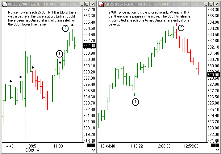
In the charts above, you’ll see two timeframes. In the larger
2700T timeframe on the left you’ll see that a directional move is
underway. Note the NR bars at points 1 and 2, flagged by the
black dot above the bars. At point 1, the price action begins
a retracement as it approaches a resistance area (last swing
high). The NR bar represents a pause in the retracement.
Just prior to the completion of that 2700T NR bar dial down to the
900T. The entry is the break of the first bar in the direction
of the trend in the 2700T. More experienced traders can
negotiate the trade on a very small timeframe such as a 50T or
smaller.
At point 2 in the 2700T timeframe, we again see a pause (NR bar)
in the move. Just prior to the completion of that 2700T bar
dial down to the 900T. A NR bar is just a pause in the
directional move and very frequently precedes a turn in the
market. It is not necessary that a NR bar be the bar that the
market turns on. It can come a few bars before. It’s
just a warning signal to start watching. The entry is the
break of the first 900T bar in the counter trend direction.
Again, more experienced traders can negotiate the trade on a very
small timeframe.
Price action in the upper timeframe must confirm, ultimately, by
making a price action trend reversal before another period of range
expansion can be expected, as seen in the range-expansion /
range-contraction chart at the beginning of the article.
However, it’s usually safe to enter on a lower timeframe price
action trend reversal because you’ll be positioned early in the
move. Remember, a small hiccup in a larger timeframe can be
quite a move in a lower timeframe. This allows you to get your
stops to breakeven quickly so even if there isn’t a market turn, you
can safely negotiate the entry and in all likelihood get a nice
scalp out of it.
Good luck. If you have any questions feel free to post them
to the emini_traders_anonymous Yahoo group board and I’ll answer
them as time permits.
Trading Tip:
Measuring with Parallel Lines
by: Judy Mackeigan
I want to thank you once again for making things so "easy" in
Ensign Windows. The chart shows my favorite use of the
parallel channel draw tool. In seconds I have all of the
lines including the extensions which makes it easy to stay focused
on the price action. The October upgrade with the chart
specific candlestick settings is a big improvement. The other
changes make Ensign more intuitive for the new user. Keep up
the great work and again thanks so much for all you do. It is
appreciated by many.
|